
Website Design
A Nail Salon Homepage Layout That Makes Booking Easier
Plan a nail salon homepage around the questions guests ask before booking: services, prices, location, real work and a clear next step.
By Ontiloo · October 14, 2026 · 2 min read
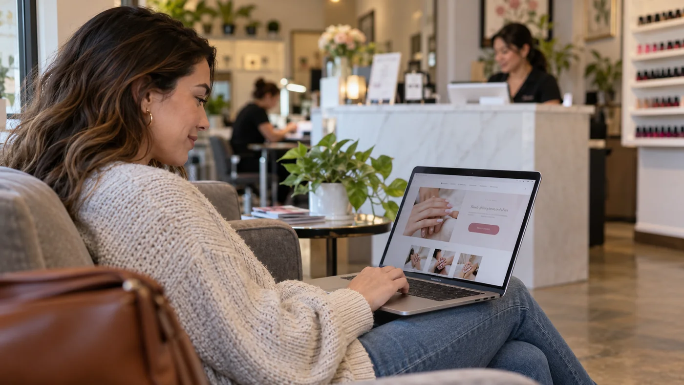
A useful salon homepage answers the visitor’s immediate questions in a sensible order. Start with what you offer and where you are, then provide enough detail to support the next action. The exact layout can vary, but the information should not require a visitor to decode a decorative design.
A practical homepage sequence
| Section | Customer question | Content to prepare |
|---|---|---|
| Opening screen | Is this the right salon for me? | Name, location, main services, representative image and booking action |
| Service overview | Do you offer what I need? | Clear service groups linked to the full menu |
| Work and atmosphere | What can I expect? | Real nail work and relevant salon photographs |
| Visit information | How do I get there and when? | Address, hours, parking notes and contact |
| Next step | How do I book or ask a question? | Correct booking destination and phone alternative |
Write the opening screen before choosing an animation
Use a specific headline rather than a claim such as “The ultimate beauty destination.” A hypothetical example is “Manicures, pedicures and nail art in your neighborhood,” followed by the actual salon and city. State only services you provide. Choose a photograph that supports the message and leaves the text readable on small screens.
One primary action usually makes the decision easier. If appointments are handled by phone, say so. If guests can book online, use the actual booking link. Secondary actions such as viewing services should support that path.
Show enough of the menu to orient people
A short service overview helps visitors recognize the category they need. Link to a readable menu for prices, inclusions and add-ons. Avoid hiding essential price conditions inside an image or an accordion that customers may never open. Use the same service names in your booking system to reduce confusion.
Give real evidence room to work
Choose a small selection of recent, permission-cleared photographs. Label examples honestly and avoid using stock or AI imagery as proof of your team’s actual work. If you feature testimonials, preserve their meaning and disclose relevant relationships. A gallery should help visitors understand the salon, not simply make the page longer.
Review the page with three tasks
Can a guest find your location, understand a relevant service and start the right booking journey? Check on a phone and with keyboard navigation. If a section slows those tasks without providing useful information, simplify it. Keep hours and prices under an assigned review process so the homepage remains dependable after launch.
Keep exploring
Published by Ontiloo · October 14, 2026. Examples are illustrative unless stated otherwise. Product capabilities, prices and platform rules should be checked against the current provider documentation and your agreement.